MYCAMPY
The hybrid application, where innovative technology matches optimal usability, a revolution in the cycling experience.
CLIENT
MYCAMPY
INDUSTRY
Innovation
SERVICES
UX/UI, web development, Android native development, digital transformation, cloud computing
TEAM
UX/UI designer, business designer, Android / iOS developer, full stack
developer
TECHNOLOGIES
Android native, React e Node.js
The context
Campagnolo is an industry leader in the production of bicycle components, with more than eighty years of proud history marked by innovation and quality, ground-braking technologies and victories. Campagnolo reached out for us, looking specifically for a partner that could satisfy their crucial need: a new engaging digital tool to make customers using more and better the company’s products.
The original app proposed by Campagnolo at the time was not functional at all. Too much of a technical approach. Lack of real tangible benefits for the end user. Downloadable yet useless. Facing such a major problem, the company set the bar high to secure only a valid alternative.
The digital transformation / mobile app project we proposed started off in 2017. Through a deep restructuring and targeted improvement of the mobile app customer experience we created MyCampy: the newly born experience of riding your racing bike, the app where components communicate intelligently with each, vastly improving the interaction of the riders on their bikes.
Empower the riders with a new way of experiencing the relationship with their bicycle. The hybrid app, with highly intuitive interface, keeping users informed about the state of wear of crucial bike components.
The challenge
It appeared to us immediately clear which would have been the main task: define a dynamic, agile, intuitive user experience, designed specifically for the sports enthusiasts focused on their riding experience.
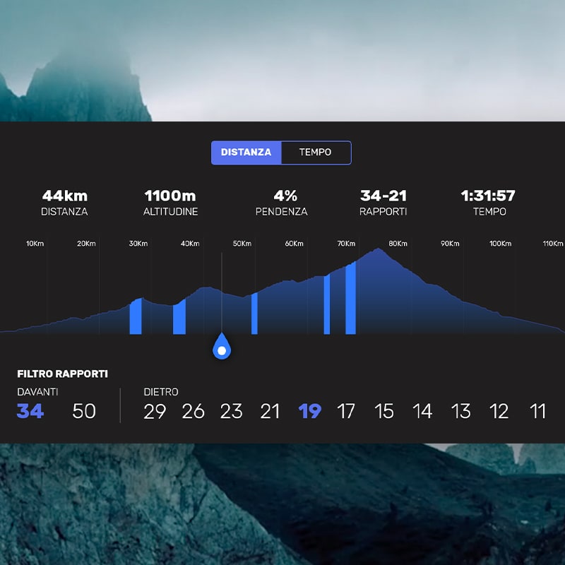
We started off from a precise workflow definition, the outcome of a targeted survey carried out on a sample of cyclists. The challenge then was to bundle the bicycle maintenance actions with customised notifications to the user through an engaging management dashboard of the Campagnolo EPS electronic gearbox, a device capable of integrating with data-set coming also from other 3rd party computer cycle devices. The solution should allow the cyclist to visualise which gear ratio he used during each session, by a simple quick look to intuitive graphics.
The solution
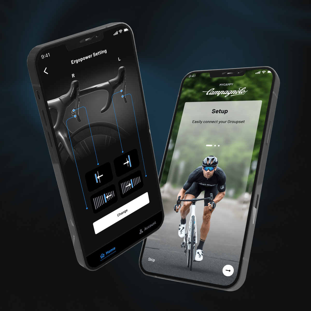
The hybrid technology proposed by Crispy Bacon implicated the use of a sole language to achieve a double output – Android and iOS. MyCampy the result: a hybrid app developed in Ionic with native plug-ins to secure hardware data-transfer, via BLE (Bluetooth Low Energy) on the EPS electronic gearbox.
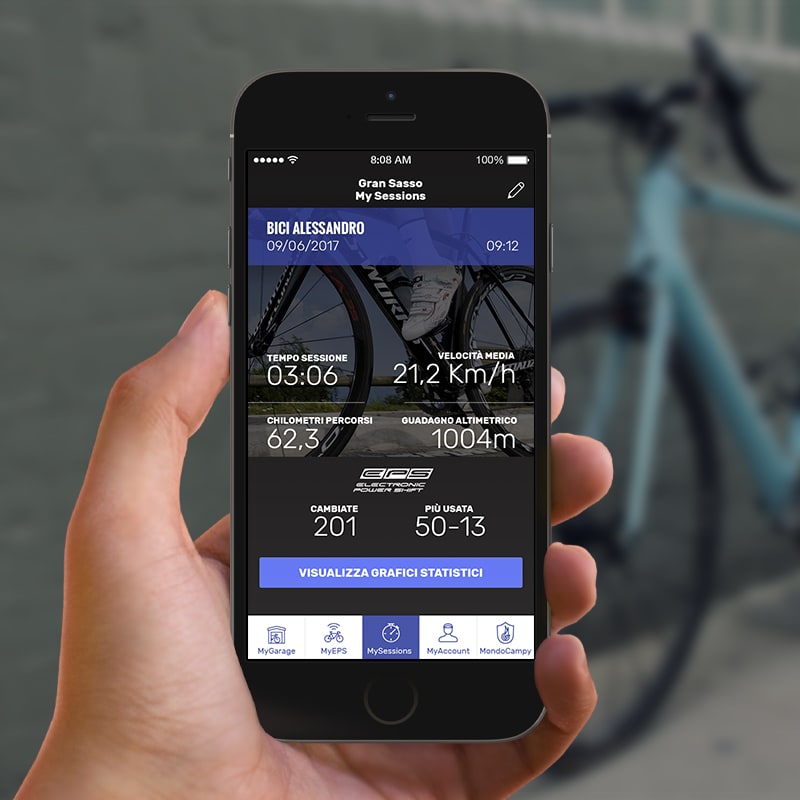
We flipped the approach, re-thinking about what a cyclist really wants from a digital product while riding the bike. Hence the creation of a “virtual garage”, where to manage and set up the bike, keeping track of all its components and above allowing users to prevent excessive wear of crucial bike components like the gearbox. The app indeed is capable of recording tons of riding sessions, skimming through relevant activities, organizing the outputs via smartphone or via the bike computer interface.
MyCampy enriches of new functionalities the EPS gearbox, opening up new key features: the riders can now visualize in real time how much wear on each component. Through push notifications, the innovative app sends messages to the cyclist, suggesting maintenance routines and (through corporate marketing integration), guiding to the nearest Campagnolo dealer to buy official components and spare parts.
One of the first apps developed in Ionic capable of connecting with hardware components. MyCampy achieved + 40% in active e usage time compared to the previous product.
The results
The disruptive approach we applied to the project led to development of one of the first Ionic apps ever marketed. A milestone we achieved thanks to the balanced mix of native and hybrid language, effective UI, reliable integration with the EPS electronic gearbox.
With MyCampy, the company bumped up + 40% of constant app users with an impressive increase in the average rating of the application.
The project was a win-win, bringing advantages for all the players, for the riders, to us, to Campagnolo itself. The company is now able to obtain data on the use of its products and those of its competitors (3rd party cycling computer devices used in the bike are grouped in the app and are selectable). On the other end, the rider is now constantly updated about the state of wear on the main bike components.
Nonetheless, the product UI was another major step forward, with menus where to track the sessions history, visualised via graphics, capable of displaying each type of gear change recorded at a specific moment in the bike session.


